Hey, Reader!
Happy Thursday, aka Eduletter day!
Fun fact: squirrels bury thousands of nuts every fall, and a lot of them never get dug back up. (That's how plenty of oak trees get planted, so I guess that's good for us even if it's kind of disappointing for the squirrels.)
I know what you're thinking. "But Mandy, what does this have to do with my business?"
Just hear me out.
When it comes to behind-the-scenes organization, I'm a total squirrel. I stash things everywhere with the best intentions.
Okay, so I'm going to be embarrassingly honest with you. I don't have a brand kit.
I kinda have something in Canva. I've got hex codes saved all over the place... and most of them are the same, font names in others, and I have a few notes jotted down about how and when to use them.
Here's what it costs me. When I sit down to finish a social post, an email header or a sales graphic, I have to make the same decisions all over again. Which pink? Which font? Twenty minutes or more are wasted on searching for something that I need.
The worst part is, I teach this stuff. I know what I need to do. But between all the other things I'm juggling, making a brand kit just didn't seem to make it to the top of my priority list.
I know I'm not the only one.
So today we're talking brand kits: what they are, what goes in one, and how to actually use one once you have it.
But first, some beautiful work that caught my eye this week:
|
|
|
HANNAH DIAL ART
Buttercream and Cornflower Blue
Soft mint green sets the stage for dusty cornflower-blue blossoms, while buttery cream accents keep the palette light and airy. The deeper blue ribbons add contrast, and tiny ivory stars give the whole thing a little sparkle. Sweet and nostalgic without being sugary.
French Country Whimsy
Delicate bouquets spill from mismatched vintage pitchers and vases. The loose, hand-drawn outlines and imperfect shapes give this traditional floral theme a playful personality. French country charm with a storybook wink.
For the Romantic Who Doesn't Take Herself Too Seriously
Picture cheerful kitchen curtains, café-style table linens, or wallpaper in a sunny breakfast nook. The ideal buyer loves vintage glassware and fresh flowers from the farmers market. A little cottagecore, a little Paris flea market.
|
|
|
|
UNIQUE CREATIONS BY NIRALI
Retro Warmth
Burnt orange, golden mustard, chocolate brown, and muted olive create a distinctly 1970s palette. Cream-colored flowers pop against the earthy blocks, keeping the saturated colors from feeling too heavy. Warm, confident, and wonderfully nostalgic.
Flower Power Meets Geometric Order
Oversized daisies, branching leaves, and stylized blooms borrow from midcentury folk art, while the alternating rectangles create a lively, almost quilt-like rhythm. The simplified shapes and strong contrast make this pattern easy to read from across a room. Groovy, not busy.
Made for the Vintage-Loving Creative
This print belongs on canvas market totes, retro kitchen accessories, throw pillows, or a cheerful picnic blanket. The ideal buyer browses thrift stores for original Pyrex, loves a good record shop, and mixes vintage finds with modern pieces. She's not trying to recreate the seventies. She's borrowing the best parts.
|
|
|
|
ANNA BLACK CREATIVE
An Antique Garden
Dusty coral, soft apricot, pale butter yellow, and muted sage settle beautifully against a warm ivory background. The restrained palette has the gentle, timeworn quality of antique botanical illustrations. Nothing shouts for attention, and that's precisely its charm.
Wildflowers with a Tailored Edge
Delicately etched blossoms wind through vertical panels, balanced by narrower stripes of climbing leaves. Fine line-work gives the flowers an almost engraved quality, while the repeating columns bring structure to the wandering stems. Victorian botanical meets classic English cottage wallpaper.
For the Collector of Beautiful Old Things
Lovely on café curtains, upholstered dining chairs, vintage-inspired wallpaper, or the lining of a handmade keepsake box. The ideal buyer collects antique botanical prints and treasures inherited furniture. She wants something that feels discovered, not mass-produced.
|
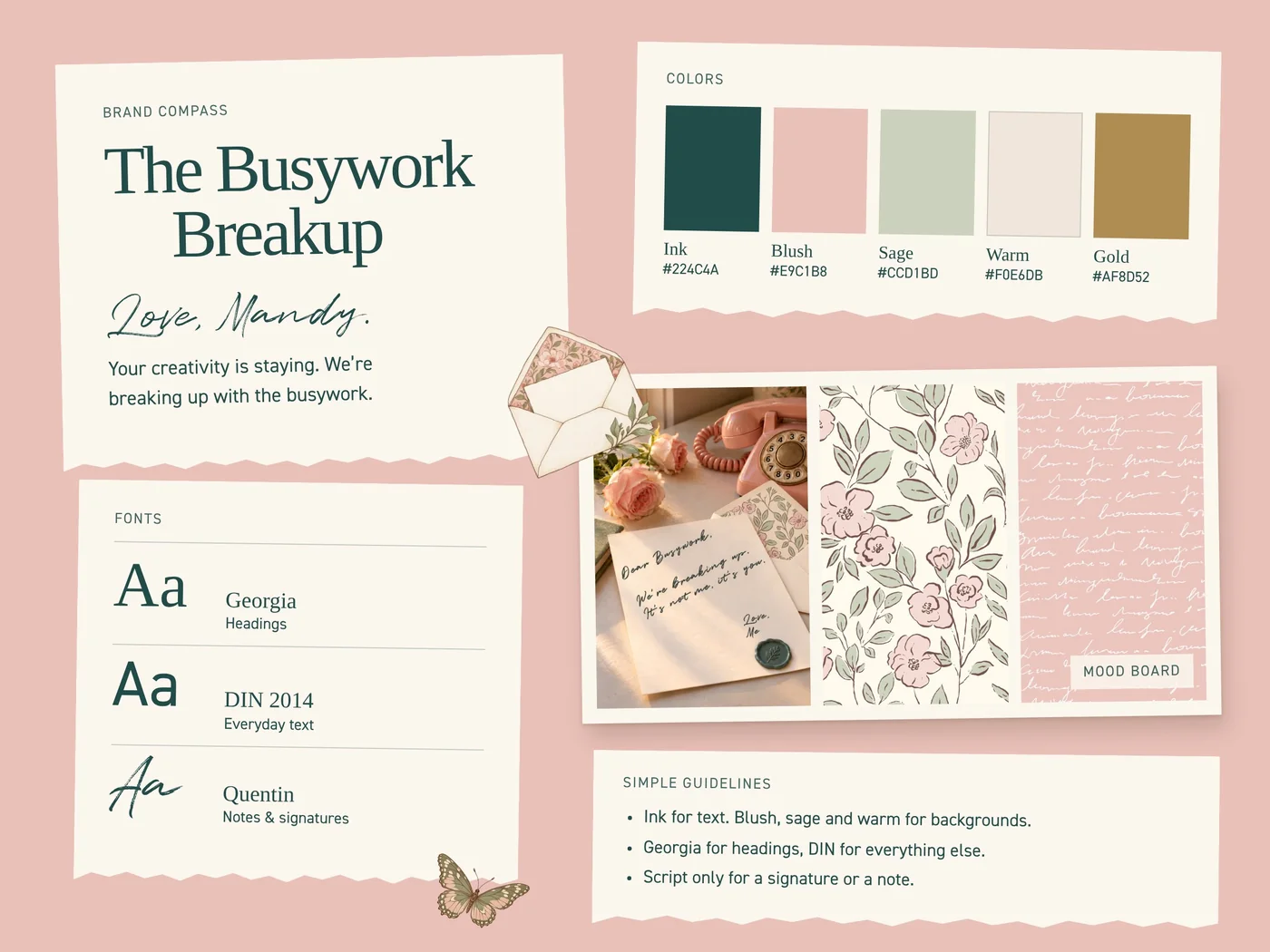
A quick reality check before we start. A brand kit is not just about a logo and colors. We're not doing a rebrand either. You don't need to hire anybody, and you don't need to change what you already have.
It's just writing down decisions you've already made and putting them all in one place, so you don't have to make the same decisions over again and again.
Tip #1: What is a brand kit (and what goes in it)
A brand kit is a reference guide for how your business looks. Every visual decision you've made lives in one place. The next time you create something, you pull from the kit.
Think of it like the coordinates in a pattern collection. Your hero print gets the most attention, but the blenders and coordinates make the whole collection feel like it belongs together. Your brand kit does that job for everything you post, send and sell.
Here's what goes in mine (the one I'm finally finishing):
1. A Brand Compass
Compasses are not just for old-timey explorers. You need one for your brand.
All you need is a short note, just a few lines, about your business and the feeling you want people to get from it. It guides every other choice in the kit.
- What I make: surface pattern designs
- Who it's for: interior designers and DYI home owners
- The feeling: warm, lively, down-to-earth, encouraging
- Not this: post-modern, dark, heavy, ultra-realistic
That last line is sneaky useful. Knowing what you're NOT can make decisions move faster.
2. Your colors
"Pink" doesn't work here. You need hex codes:
- 1–2 main colors (the ones people should connect with you)
- 2–3 supporting colors
- 1 accent color for buttons and calls to action
- A neutral or two for backgrounds and text
Write down the HEX code for each one. (That's the six-character code, like #E8B4B8. Canva, your website, and your email platform all use it.)
Pro Tip: Your brand palette is not the same as a pattern or collection pallette. Your art doesn't have to match your brand kit. Your art can be any color.
3. Your fonts
Two is plenty, or three if you want a fancy one for special occasions:
- A heading font
- A body font for everyday text
- An accent font (optional, and used sparingly)
Then write down how you use them: headings in this one, body text in that one, script for one or two words at most.
4. Your images
Think of it like a mood board. You want a few photos and textures that capture the look you're going for: the lighting, settings, props and overall vibe of your product shots. It keeps your feed looking consistent and it will be a big help if you ever want to hand anything off to an assistant (human or AI).
5. Simple guidelines
Write a few plain-language rules for how it all works together. For example:
- "Patterns are the star. Text sits on cream or blush, never on top of a busy print."
- "One script word per graphic, max."
- "Teal is for buttons and links only."
That's it. One page.
Tip #2: How to use your brand kit
Here's where people get stuck. They build a gorgeous kit... and then it lives in a folder.
Which, hello, reminds me a lot of a squirrel burying a nut and never coming back for it.
Let me tell you about two designers.
Designer A spent a whole weekend making a beautiful brand kit PDF with her colors, her fonts, the works. She saved it to her desktop. Three weeks later she's making a sale graphic at 10 p.m. She can't remember which green she picked, so she grabs whatever looks close. Her kit didn't fail. It just wasn't anywhere she was working.
Designer B made a simpler kit, but she put it everywhere she makes things. Her colors and fonts are loaded into Canva. She saved templates for her three most common posts. She also has a copy of the kit in her drawing tool and the AI tool she uses, so it knows her colors and her vibe before she asks for anything. When she makes a sale graphic at 10 p.m., it only takes a few minutes and it's on-brand.
Here's how to use yours:
Put it where you work
- Canva: Add your colors, fonts and logo to Canva's Brand Kit if you have Canva Pro. If you're on the free plan, create your brand kit in a one-page document and 'Favorite' it. It will be right there every time you start something new.
- Your website and email: Set your colors and fonts as the defaults on your website and in Shopify, Kit or whatever tools you use, so every new page starts on-brand.
- Your AI tool: Paste your Brand Kit into Claude (or whichever tool you use). Then when you ask for caption help or layout ideas, it already knows the feeling you're going for.
Make 3 templates
Think about the 3 things you make most often. Build one template for each from your kit. Next time, you just swap in the art. Boom. Done before your coffee gets cold.
Use it as a gut check
Before you hit publish, compare it to your Compass. Does it feel warm and lively? Or did "corporate" sneak in? It's a quick check, and it saves you from the "why does my feed look weird" spiral later.
Update it (rarely)
Your kit isn't a tattoo. If a color stops feeling like you, you can change it. And guess what's so cool? You only have to change it in the kit, once, not in every random file you own. Then use it to update your tools. So. Much. Easier. Than trying to find all those nuts you buried all over the yard.
Tech Hack: Break up with your busywork.
Okay, remember my embarrassing confession? About the... ahem... brand kit?
Here’s the rest of that story. I finally sat down to pull mine together: colors, logo, fonts, compass, etc. All of it in one spot. Somewhere around the third time I went hunting for another hex code, it hit me. If I’m going through this anyway, why am I doing it alone?
Because let’s be real. Knowing how to make a brand kit was never my problem. Finishing one was. Without a deadline and someone checking in, it slides right back into the “someday” pile.
So I turned my process into something we can do together, with accountability built in this time.
The Busywork Breakup is a 7-day challenge. You’ll build your brand kit inside Claude, then use it to make something real for your business.
We're breaking up with choosing fonts again.
We're breaking up with hunting for that color again.
We're breaking up with digging through old files to get your logo final.final.final. version... or was it final.final.final.final?
Here's the week:
- Sat, Nov 14 — Dear Busywork, We're Done. Write your Brand Compass.
- Sun, Nov 15 — It's Not Me, It's My Style. Build your mood board.
- Mon, Nov 16 — No More Mixed Signals. Choose your colors.
- Tue, Nov 17 — Know Your Type. Pick your fonts and decide how to use them.
- Wed, Nov 18 — Make It Official. Bring it all together into your brand kit in Claude.
- Thu, Nov 19 — I'm Taking My Brand With Me. Prep your kit for Canva, your website, emails and social.
- Fri, Nov 20 — The Breakup Glow-Up. Make something with your kit and show it off.
Along the way you'll get daily Breakup Letters in your inbox, "Brand Red Flags" lessons on the visual habits worth rethinking, and a spot in The Breakup Club, our private community. Replays and the community stay open through December 1.
It's $10. Claude Pro is recommended because some lessons use paid features. Any Claude subscription is separate from the challenge fee.
And to be crystal clear: This isn't making your art with AI. It's just about using Claude to help you organize and get your branding info all in one place, so you stop wasting time digging for it.
Doors are open. I'll be doing it right alongside you. Your creativity is staying. The busywork isn't.
That's all for now! It's time to create!
You don't need perfection. You just need consistency. One place for the brand decisions you've already made.
Before you go, tell me:
| Where are you on your Brand Kit? |
|
|
|
|
|
I read every response, and they shape what I write about. Don't be shy. 😊
Until next Thursday, keep creating!
P.S. The Busywork Breakup runs Nov 14–20 and it's just $10. Registration is open.
P.P.S. Fellow squirrels, hit reply and tell me where your brand colors are hiding right now. No judgment. 🐿️